|
| Case 15 / 17 |
  |
Display Case 15 (Fuss, Goldin, Baldessari)
In his recent series My Ghost, contemporary artist Adam Fuss produced photograms of smoke and other artifacts, including 19th century children's dresses. The transparency of the dresses lends the work a haunting fragility.
The cover design for Kim Edwards' The Memory Keeper's Daughter may not have been as likely without the prior influence of Fuss's work.
Title: The Memory Keeper’s Daughter
Author: Kim Edwards
Publisher: Penguin 2006
Designer / Illustrator: Gregory Mollica
Photographer (dress): Liz Magic Laser
Photographer (snow): Roy Mehta/Photonica.
|
 |
 |
For the Harper Perennial edition of 1959, Thulani Davis' coming of age novel set in the early days of the Civil Rights Movement, Honi Werner (a designer and illustrator who often raids the icebox of art history for imagery to work with) has rendered an impressionistic copy of a small, central detail in Nan Goldin's dreamlike Sun Hits the Road, Shandanken, NY 1983. This cover is proof that even the smallest detail of a photograph may provide grist for the designers mill.
Title: 1959
Author: Thulani Davis
Publisher: Harper Perennial 1993
Designer / Illustrator: Honi Werner.
|
| |
In the composite below, Werner's cover had the center image removed and was then laid over a copy of Goldin's original:
 |

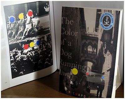
Title: The Color of a Dog Running Away
Author: Richard Gwyn
Publisher: Doubleday 2007
Designer / Illustrator: Gretchen Achilles.
|
As part of his modus operandi, Los Angeles-based artist John Baldessari has obscured the faces (and other parts) of people in publicity photos and film stills for more that two decades. His work leans strongly toward the conceptual, and raises issues involving appropriation, 'high' art versus 'low" and the mediation of images.
In The Color of a Dog Running Away, it is Baldessari's style that is appropriated for its high-impact color and visual punning with the book's title. In other words, it is used to make a book cover that will be noticed.
Lia Chee's cover design for this book is so close to the look of a work by Baldessari that, until I check the books back flap, I thought it actually might be one. The relationship between color, relative size and psychological distance in the red, green, yellow and blue circles is not unlike Baldessari's smart, funny and playfully absurd sensibility. Interestingly, the photographic component of the cover is actually a composite of the work of three photographers, including George Rodger, one of the founders of Magnum.
|
|
Write your comments:
|
|
